Circled negative generator: copy and paste 🅝🅔🅖🅐🅣🅘🅥🅔 text
More options
Wrap
Spacing
Case
Spacing options double your character count. On a 150-character bio that matters.
What do the labels on each card mean?
U+1D400
The Unicode codepoint the style's characters come from. Two styles can look almost
identical and still be different characters with different device support. The
codepoint is the only reliable way to tell which one you copied.
IGTTRB
Platform support.
Green renders reliably.
Amber works, but breaks on some devices or in some fields.
Struck through is filtered out or rejected by that platform.
IG Instagram · TT TikTok · DC Discord · WA WhatsApp · FB Facebook · X (Twitter) · RB Roblox
The same style inside each frame. Type above and these update with it, then tap to copy the
whole thing. The number is the character count, which matters if you are pasting into a
field with a limit.
Negative circled letters invert the usual arrangement: instead of a letter outlined by a ring, you get a solid filled circle with the letter knocked out of it in white. The effect is the heaviest on this site by some margin, which is exactly why it is used for short emphatic strings and almost never for anything longer.
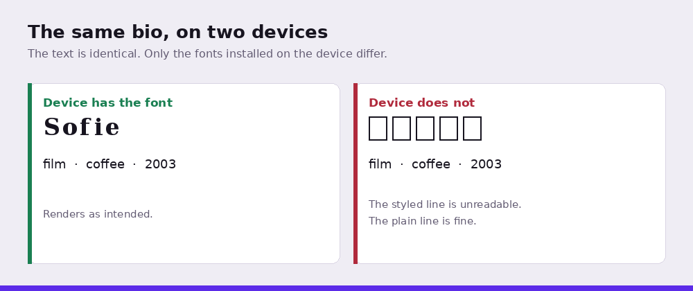
The same bio on two devices. The text is identical; only the fonts installed differ.
Where it works, and where it breaks
The important limitation is coverage. Unicode encoded these as uppercase only. There are no lowercase negative circled letters. This tool maps lowercase input onto the uppercase forms, so typing in lowercase produces uppercase-shaped output. That is a substitution, not a rendering of what you typed, and Worth knowing before you paste a name that depends on its capitalisation.
Digits are not covered either, so numbers stay plain and look conspicuously light beside the filled letters.
Support is the weakest of the enclosed styles. These characters come from a supplement block added later than the main enclosed alphanumerics, so font coverage is thinner and the odds of a reader seeing boxes instead are higher than with the plain circled style. If broad rendering matters more than impact, the outlined version is the safer choice.
Where it works
This is the heaviest style on the site, and heaviness is the whole argument for and against it. A two or three letter tag in solid circles is impossible to miss in a feed. Anything longer becomes a dense block that readers skip rather than parse.
It suits a clan tag, initials, or a single word doing a lot of work. It does not suit a name, a bio line, or anything containing a number, since digits are not covered and sit conspicuously light beside the filled letters.
Support is the thinnest of the enclosed styles. If broad rendering matters more than impact, the outlined circled style is older and covered far more widely.
Common questions
Why is my lowercase showing as capitals?
Because Unicode has no lowercase negative circled letters. Only uppercase forms exist, so lowercase input is mapped onto them. What you get is a substitution rather than a styled version of what you typed.
Why does this style show as boxes more often?
It comes from a supplement block added to Unicode later than the main enclosed alphanumerics, so fewer fonts cover it. The outlined circled style is older and more widely supported if rendering reliability matters.