Guides
Longer pieces on how styled Unicode text actually works: why it displays on one device and not another, what happens when a screen reader encounters it, and where the characters came from in the first place. These are the questions the tool itself cannot answer, and understanding them is the difference between text that looks deliberate and text that arrives broken for a share of the people reading it.
What these cover
The questions the tool itself cannot answer, and the ones that decide whether styled text works for you or quietly fails.
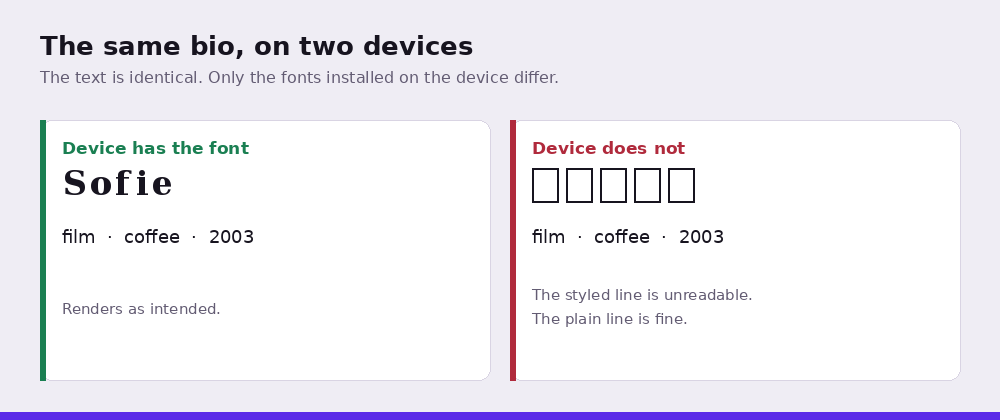
Why it sometimes arrives as empty boxes. The single most common problem, and the least understood. A box means the reader's device has no font containing that character. Your text is fine; their device cannot draw it. Which is why it looks correct on your phone and broken on your friend's.
What a screen reader hears. Styled characters are announced by their Unicode names rather than read as words, so a styled phrase becomes a recitation of character names. Unicode's own documentation recommends against using these characters in general text as a substitute for real formatting. Almost nobody in this category mentions any of that.
How to change the font in an Instagram bio. The step-by-step, including which fields accept it, why hashtags fail silently, and the trailing space that strips your line breaks.
Why they are worth reading before you paste
Every page on this site tells you where a style breaks. These explain why it breaks, which is what lets you make the call yourself rather than checking a table each time.
The short version, if you read nothing else: anything a person needs in order to act should be in plain characters. A username someone has to find, a date, a price, an instruction. Styling is for the parts of your text where appearance matters more than certainty, and that is a smaller set than it first appears.