Why fancy fonts sometimes show as boxes
If you have ever pasted styled text somewhere and watched it arrive as a row of empty rectangles, the cause is almost never the app you pasted it into.
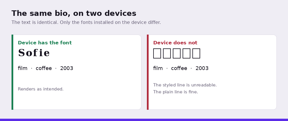
An empty box, often called tofu, after its shape, means the device received a character it understood perfectly well but had no font available to draw it with. The text is intact. The information is correct. The device simply has nothing on hand to render it, so it falls back to a placeholder that says, in effect, something belongs here and I cannot show it to you.
This explains the behaviour that confuses people most: the same text looks fine on your phone and broken on your friend's. You are not looking at different text. You are looking at two devices with different fonts installed. Whether a character displays depends on the reader's device, not on yours and not on the platform in between.
The reason it happens more with some styles than others comes down to age and purpose. The characters used by these tools were added to Unicode for mathematical typesetting, not decoration. Bold and italic mathematical letters arrived early and are now covered by essentially every font shipped with a modern operating system. Rarer sets: enclosed letters, some of the more unusual script and blackletter ranges. Arrived later or were considered specialist, and font coverage never caught up. A device from 2019 running a stock font may cover the first group completely and the second not at all.
Combining marks fail differently, and worse. Strikethrough and underline styles work by attaching a separate invisible mark to every character. The device is then asked to draw two things in one space, and when it cannot position them correctly the result is not a clean box but a smear of marks landing in the wrong places. This is why those styles look fine in one app and mangled in the next: the app's text engine is doing the positioning, and text engines vary.
There is no way to guarantee a character displays on someone else's device, because you have no control over what fonts they have. What you can do is choose styles whose characters have been around long enough to be universally covered. Bold, italic and sans-serif variants are the safest. Enclosed and negative-circled styles are the least safe. Everything else sits between.
The practical rule that follows: never put information someone needs into decorative characters. A username, a date, a price, a link. Anything that has to be read to be useful should be plain text. Decorative styles are for the parts of your text where appearance matters more than certainty, and that is a smaller set than it first appears.
There is a way to check before you commit, and it takes less time than fixing a broken bio after people have seen it. Send the text to yourself on whatever platform you plan to use it on, then open that message on the oldest phone you have access to. Not your own phone, which is likely newer than your median reader's, and not a desktop browser, which draws from a much larger font library than any handset. An older Android device is the honest test, because that is where coverage gaps show up first and where a large share of this audience actually reads.
If you cannot borrow one, the next best proxy is to look at which block a style comes from. The mathematical alphanumeric ranges, bold, italic, monospace, sans-serif and their combinations, are the oldest and best covered. Enclosed alphanumerics, negative circled forms and the supplement blocks came later and are covered patchily. Combining marks are a separate problem again, since they depend on the text engine rather than the font.
None of this means avoiding styled text. It means knowing that a proportion of your readers, smaller than you fear, larger than zero, will see something other than what you see, and deciding in advance which parts of your text you are willing to let that happen to.